


Digital Fridge
An improved design of existing grocery tracking apps (focused on Kitchen Pal), through comparing many competitive apps and user test/surveys, this new design includes features that people want but haven't received.
This is a partnership project created with my classmate Leander Bai
Time/Year: Fall 2023
Where: NYU New York
Role: Designer
Skills/Tools: Figma, Design Thinking

Individual Contributions:
- Ideation
- Created survey and questions
- Persona
- User Journey
- Wireframes
- Analyzed competition in these types of apps, looked for all insights
- Decided on the placement and design of the app
- Did some work on Figma (majority was done by my partner)
Do you ever...
BUY FOOD
STORE FOOD
TIME PASS
DAYS PASS
FOOD -> TRASH
What to do?
*fridge app*
*fridge app*
*fridge app*
*fridge app*
*fridge app*
*fridge app*
*fridge app*
Problem: Significant food waste occurs in American households annually due to poor grocery management, leading to financial losses and wasted resources. A solution is needed for individuals who frequently forget about purchased groceries.
Brief: How can we manage our groceries, keep our fridge organized, and reduce the amount of expired food?
Research
Research Methods:
- Looking at competitors- reading reviews and comments about them
- Surveys/Interviews- asking users that deal with this problem
Quick Research:
- Already has existing apps (ex. Pantry Check, USDA Food Keeper, Kitchen Pal, etc.)


General pros of these apps-
-
consistent and cohesive style (colors and font) and visuals (pictures or symbols)
-
ability to organize food into certain categories
-
input for expiration date
General cons of these apps-
-
has options to find existing product within the app but no customization with own products
-
hard to look through (too much writing in a list)
Persona

Name: Mary
Age/Demographic: 46 years old
Education: Got a bachelor's degree and has a flexible office job
Lifestyle: Lives with her two kids and whenever she isn't working she needs to take care of them (babysitter for the rest of the time) because her husband travels for work and isn't home often
Goals: Being able to spend time as a whole family, seeing her kids grow up healthily
Motivation: Being able to spend time as a whole family, seeing her kids grow up healthily
Frustration: Work life balance is hard and is worried that her kids aren't getting enough nutrients when she takes care of them, she often forgets to eat herself since she is always thinking about other people
User Journey

Wireframes
These are the initial wireframes that my partner and I drew before starting to prototype on Figma


Survey+ App Review+ User Test Findings


Based on the survey results many people said that when they go grocery shopping they buy between 6-10 items lasting them between 1-2 weeks. I personally think that is not enough items to last 1-2 weeks but yet people still have expired items by the end. I think this means that people often times don’t really think about the amount they should be buying that is fit for their schedule and needs. So I need to add a shopping recommendation for the amount of food they could possibly buy that will be sufficient enough until their next purchase, this could reduce the amount of expired food or not having enough.

People have their own ways of thinking about what to buy and I wanted to give options, so like for example people said they think off the top of their head, they have a list, or they just roam. I want to incorporate all of those methods when they are making their shopping decisions.
Survey Findings:
-
Embrace minimalistic aesthetic
-
Recommend recipes based on expiration date
-
Offer shopping recommendations based on quantity
-
Provide weekly planner/meal tracker feature
-
Support various methods of list making
App Store Reviews Findings (Kitchen Pal):
-
Introduce favorites for personalization
-
Categorize food items holistically rather than by brand
-
Opt for larger, clearer pictures with simpler descriptions
User Test Findings (Kitchen Pal):
-
Implement direct input for quantities instead of repetitive tapping for bulk itemsImprove image clarity to enhance appetite appeal
-
Simplify recipe navigation by incorporating top-level categories
-
Streamline features to avoid overwhelming users
-
Use intuitive units for food quantities (e.g., packs instead of grams)
-
Optimize recipe instructions for better readability and navigation
So how did I address these findings and how is it reflected in the drafts?
Recipe Page


Kitchen Page

Clear pictures and optimized recipe navigation
+ on the top right corner for users to create their own categories
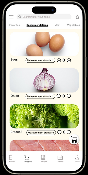
Shopping Page

Planner Page


Shopping cart= shopping list
Added a measurement standard
Different shades of number to represent past and - easier access to previous meals
Off the top of their head- search bar
Roam- scroll around in the different categories
Profile Page


The style is minimalistic and easy to read